NOTE: This article was originally published in the Irish Independent Written Word Supplement, March 2014.
Publishing houses often create more than one cover for the same book, particularly if they feel the book will appeal to ‘multiple target demographics‘. In simple English, this means they think people of different ages, life stages, genders, hobbies and education levels will all like this book so they can’t just target one specific group (young adult readers, romantic fiction fans, sci-fi nerds) with their advertising efforts.
One way they get around this is by creating different book covers aimed at different groups. For example, you can probably remember that there were children and adult book cover versions of all of the Harry Potter books so that adults didn’t have to feel embarrassed sitting on the train reading them!
As with the photographs, you may be presented with more than one cover and asked which one you prefer, or which one best captures the theme of the written text. In this case an extract from the novel itself will most likely accompany the book covers so that you get a flavour for the book even if you haven’t read it. You might also be asked to say whether or not the book cover would entice you to buy and read the novel.
When assessing the effectiveness of a book cover or for that matter of any product or advertisement ask yourself three questions:
-
Does it grab my attention?
-
Does it make an impression?
-
Does it convince me to buy the book / product / service?
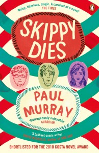
Have a look at this book cover for the wonderful novel Skippy Dies by Irish author Paul Murray.
Sample Question:
Does this book cover for “Skippy Dies” make you want to read the novel? Give reasons for your answer, based on a close reading of the various visual and textual elements. (20 marks)
Sample Answer:
This book cover instantly grabs my attention. I really like the design and colour scheme: the geometric pattern of semi-circles in alternating shades of green and red against a warm cream background is quite hypnotic. It also looks like the cover had water spilt onto it in places as the paint has smudged and I feel this prevents the design from being too clinical in appearance. This slightly bohemian edge is again evident in the vertical lines drawn by hand around the edges of the rough red and cream semi-circles which reveal the title of the novel and the author. I like the handwriting font too which adds to the informal vibe. All of these features add a warmth to the book cover; a willingness not to be too perfect, which I really like.
In much smaller font at the top and bottom are quotes from reviews, sourced from reputable newspapers The Times and The Guardian. Including these snippets tells us this is literature, not pulp fiction, and yet the promise of fun and entertainment ensures we’re not scared off – if reading this book is “hilarious” and “outrageously enjoyable” then I can cope with the “tragic” content!
At the very bottom of the page we’re told this book was “SHORTLISTED FOR THE 2012 COSTA NOVEL AWARD” and fellow author David Nicholls describes Murray as “A brilliant comic writer” At this point it’s difficult to resist this book, it’s being so highly praised!
The title also instantly intrigues, with the stark warning that in this book “Skippy Dies”. It’s a daring concept to tell the reader what’s going to happen and yet still ask them to invest their time and emotions in the characters, three of whom are represented in little uneven edged coloured blobs, each with their own rough line drawing. The presence of two boys and one girl at first brought a love triangle to my mind, but the fact that the girl is on the right rather than in the centre made me question this assumption. Their youth suggests that this might be a coming of age story, but my awareness that a central character dies gives this book an edge. It makes me think this is not going to be some twee little teen romance, but rather a book which challenges and provokes.
To conclude, this book cover most certainly made an impression on me and I am now tempted to leave the exam hall to go buy it!


