NOTE: This article was originally published in the Irish Independent Written Word Supplement, March 2014.
We all know a good photo when we see it: a splash of colour, a glint in the eye, a captivating landscape, a moment frozen in time. Yet articulating what makes an image spellbinding can be quite difficult.
It can help to think of your eyes as zoom lenses and of the photo as a puzzle to be deciphered. Each piece of the puzzle can be zoomed in on individually, analysed, discussed and interpreted. Each element contributes to helping you make sense of the bigger picture.
Consider some of the following elements when interpreting an image:
Framing: What is your eye drawn to immediately? What’s in the foreground / background / centre / left / right of the frame? Is everything in focus or are some elements blurry? Why might this be?
Body language & facial expression: What mood is reflected in the subject’s face? Are their eyes telling you something? What about the tilt of their head? Look at their hands and arms and legs: are they reaching, holding, relaxing, moulding? Does the slope of their shoulders reflect their mood?
Setting: Where is the photo taken? When? Consider time of day, season and era. Clothes, hairstyles, accessories and objects can give you clues about where and when the photo is set.
Lighting & colour: is the lighting natural or artificial, indoors or outdoors? Are shadows used? To what effect? What colours stand out? Do they symbolise anything? Has a filter been applied? Why?
Comprehension questions on visual texts:
In the exam, there will typically be two or three images accompanying each written text. These can be any mixture of photos, paintings, graphs, book covers and possibly even cartoons, posters and advertisements. Although these last three have yet to make an appearance, whoever is setting the papers seems to like mixing things up a lot, so expect the unexpected! No matter what type of visual text appears, remember to zoom in on details, colours and, if relevant, text (font size & style). Questions can ask you to select your favourite image and explain why you like it; to describe the impact of the photo on you intellectually and emotionally; to evaluate how well an image captures a theme; or to assess how well the written and visual elements work together.
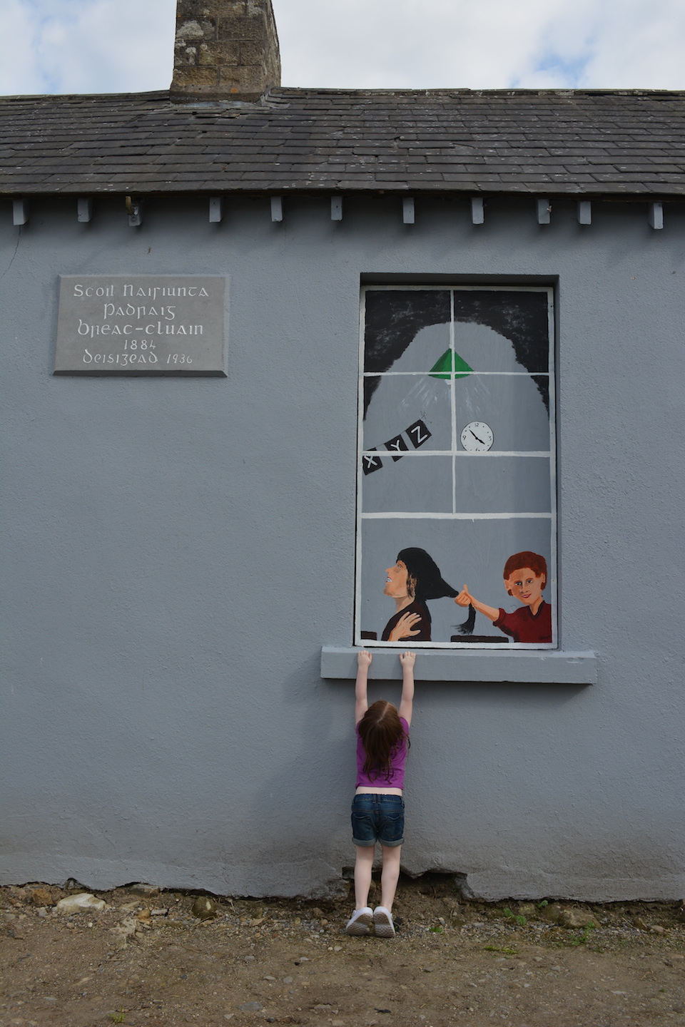
Let’s imagine this photo, and two others, accompany a text on the theme of childhood.
Sample Question:
“In your opinion, which of the visual images best captures the theme of childhood? Give reasons for your answer, supporting your points through close analysis of the visual text”. (20 marks)
Sample Answer:
In my opinion, image two, which shows a young girl reaching up to grasp the window ledge of an old school building, is the image which best captures the theme of childhood. Her small body is barely tall enough to see in the ‘window’ so she is on her tippy toes, her head is tilted right back and both of her arms are at full stretch. Her curiosity to see and to know, which is such a feature of childhood, is really endearing in this photo. [Focus on body language]
She looks too small to have started school yet and there is a nice contrast between the little girl outside the window and the painting of the two older children who are ‘in’ the schoolhouse. They are not nearly as enthralled by the concept of school once they have seen it from the inside, which is so true of childhood. As a child, you often want something really badly but once you’ve got it, you tire of it easily. [Focus on framing in the image, particularly the use of contrast]
I also found the detail in the painted children quite striking. The boy at the back of the window frame is pulling the hair of the girl in front of him. She looks quite distressed, while a shadow across his face captures his cruel intention. This detail captures the casual torment and violence children are capable of inflicting on each other. Physical fights, slaps, hair pulling and kicks from siblings and classmates are a feature of childhood many of us remember with a cold shiver down our spines. [Focus on facial expression & light/shadow]
Finally, this photo reminds me powerfully of schooldays from my childhood that seemed to drag on interminably. Neither of the painted children are paying any attention to their schoolwork: however, the clock on the wall says that it is a few minutes to four o’ clock so it’s hardly surprising that they’re finding it hard to concentrate! The torture of being trapped in the school for what seems like forever is further emphasised by the fact that it is clearly a bright summer’s day, reflected in the t-shirt, shorts and crocs worn by the little girl and in the blue sky at the top of the photo peeking through the fluffy white clouds. [Focus on weather, clothes and lighting to reveal season]
For all of these reasons, to my mind this striking image brilliantly captures the wonder, curiosity, fickleness and cruelty of childhood.